
We Got Ourselves a New Logo
 by Matt Coyne on Sep 8, 2025 9:47 PM EDT
in Latest News
by Matt Coyne on Sep 8, 2025 9:47 PM EDT
in Latest News
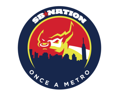
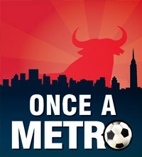
Everyone knows how resistant to rebranding MetroBulls fans are, but hear me out for a minute. In the next month, we'll be unveiling a number of new features to this site -- and network wide -- but we'll start small. Above is our new logo. If you visit other SBNation blogs, you'll see they're getting similar makeovers. If you're lazy, you can just view all the logos here.
The network wide makeover is being done under the theme "united through individuality" -- if you visit the above link you'll see they're all different, yet retain certain similarities. The new logo is just the first step in a process being touted as "most exciting and radical transformation in the eight-year history of the company."
There's much more to come in this transformation. Although the logo might seem a small change, there's much more to come for this blog, and the rest of the SBNation network. Trust me, it's something you're going to want to stick around for.
![]() 2 comments
|
Add comment
|
0 recs |
2 comments
|
Add comment
|
0 recs |
Do you like this story?

Comments
Looks great. :)
@DigDeepNYR
"It's just pain." -Brandon Prust | "The arsonist has oddly shaped feet." - Ron Burgundy
Blueshirt Banter
by Dig Deep on Sep 11, 2025 10:21 AM EDT reply actions
Something to say? Choose one of these options to log in.

- » Create a new SB Nation account
- » Already registered with SB Nation? Log in!
Secondary Sidebar
User Tools

- Start posting on Once A Metro
- Once A Metro on Facebook
- Follow @Once_A_Metro
- Follow Once A Metro on your Android Device!
- Subscribe to Once A Metro Stories
FanPosts
Community blog posts and discussion.


